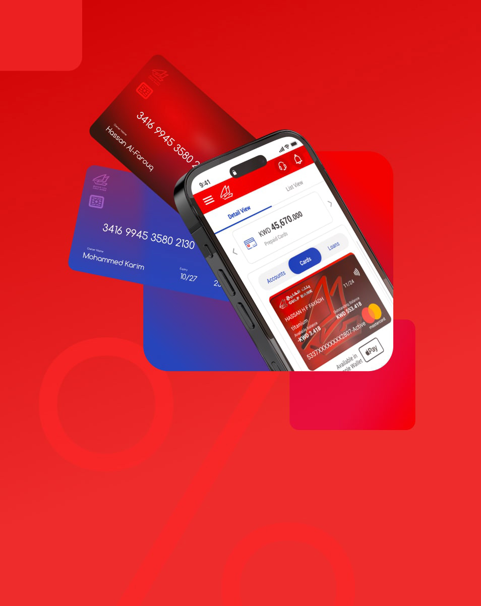
For most companies, the problem is not spending. It is visibility. Expenses leave through corporate cards, cash, and reimbursements; receipts arrive late or not at all, and finance teams discover what was spent weeks later, one spreadsheet at a time. Without that visibility, budgets are estimates, and savings are accidental.
BEX was created to close that gap: a corporate expense management platform that combines digital-first corporate cards, configurable spending policies, instant receipt capture, real-time tracking, and fast approvals in one system.
At its core sits the admin portal, the tool finance teams use to fund the company, issue cards, set limits, approve spend, and turn every transaction into insight for budget planning and savings. Around it, an employee mobile app makes compliant spending effortless, while a brand and a website introduce BEX to the market.
Mindflares was brought in to design the whole ecosystem: the brand identity, the admin expense management portal, the employee mobile app, and the website.
The mandate:
Give finance teams real-time visibility and control over company spending, without adding admin work
Turn transaction data into insights that support budget planning and cost savings
Make spending, receipts, and approvals effortless for employees on the go
Connect the admin portal and the mobile app, so every action on one side is reflected instantly on the other
Build a brand that feels credible, digital-first, and business-ready from day one
Challenges
The brief was not a single product. It was an ecosystem: an admin portal for finance teams, a mobile app for cardholders, a website to acquire new companies, and a brand to hold it all together.
The complexity sat in the admin portal. Every movement of money had two sides, every policy had to be enforced without slowing anyone down, and every figure on screen had to be reliable enough to plan a budget on.
Methodology
We approached BEX as one service with two front doors, designing the admin portal and the employee app as a single system rather than two parallel products.
Two principles guided the work from day one:
Design the loop, not the screens. Every admin action was traced to what the employee sees, and every employee action back to what lands on the finance team’s desk. A screen that broke the loop was not finished.
Control should feel like convenience. Policies, limits, and approvals exist to protect the company, but the people working within them should experience speed, not friction.
Empathize
Define
Personas
Brand Identity
Ideate the Solution
Prototype
Validate
Design Brought to Life
Value Created
Empathize with Users (Finance Teams and Employees)
Nobody opens an expense tool because they enjoy expenses. A finance manager opens the admin portal to answer a question: where did the money go, was it within budget, and where can we save? An employee opens the app at a cash register, in a taxi, or at an airport, with a card in one hand and a receipt in the other.
So we started with the flow of money rather than the interface. Where does it enter the company, how does it reach an employee’s card, and how does it return as a recorded, approved, and categorized expense? Who waits on whom at each step, and where does a receipt usually get lost?
The answer shaped the whole product. Finance teams and employees were never using two separate tools. They were holding two ends of the same transaction, and the experience had to treat them that way.
About the Research
Our research followed the full lifecycle of a business expense, from company sign-up to approved spend:
Stakeholder interviews: capturing business goals, functional requirements, and the expected user journey for each app and each role
Requirements analysis: translating the interview findings into an information architecture and draft wireframes for the admin portal and mobile app
Persona definition: identifying the admin and employee roles the platform serves, and what each needs to see, decide, and do
Journey mapping: walking each persona through a realistic end-to-end scenario, from account activation to an approved expense, and mapping every hand-off between the two apps
Friction isolation: finding where onboarding, funding, or receipt submission risked turning a simple payment into paperwork
Define
The research converged on one reframe.
That shift reordered the product. The admin portal stopped being a reporting tool and became the command center where money is released, controlled, analyzed, and closed. The app stopped being a card viewer and became the place where spending is requested, made, and justified. Every screen’s job became keeping that loop moving and turning it into data the finance team can act on.
Personas
We designed for a company, not a single user. A finance lead and the people spending on the company’s behalf needed the same platform to behave differently, without anyone waiting on anyone else. All four work at the same fictional company, so every journey could be tested as one connected story.
Brand Identity
Before a single screen, BEX needed a face. We started with the brand concept and logo: a rounded B mark moving from deep navy to teal, paired with a confident wordmark, designed to feel simple, reliable, and business-ready.
The identity was built to travel. It had to hold on a corporate card, an app icon, a finance dashboard, and a website, and feel like the same trustworthy product at every touchpoint. That foundation shaped every interface that followed.
Ideate the Solution
We designed BEX as two products deliberately joined: an admin portal built for control, oversight, and financial planning, and an employee mobile app built for speed. Neither was considered finished until it worked with the other.
User Flows
The admin flow: sign up, activate the company, fund the vault, add users, issue cards, set controls, approve, and analyze. Thorough by necessity, because this is where company money is released, rules are set, and spending becomes insight.
The employee flow: activate, get funded, request more, pay, scan the receipt, and submit. Short, mobile, and built around the moment of purchase.
Keeping them distinct is what allowed BEX to be both strict and simple. BEX didn't remove control from the employee’s path; the admin configured it in advance.
Between them sits the mechanism that gives BEX its story. When an admin adds a user, the employee receives an activation code. When the admin tops up a card, the employee is notified. When an employee taps Fund Me, the request appears on the admin dashboard. When a purchase is made, the receipt is submitted from the phone, and the expense lands in the portal for approval.
Connection was the ambition. Two interfaces, one live picture of company spend, and no one waiting on an email.
Wireframes
We began with the information architecture. Using the requirements gathered during the stakeholder interviews, we defined the portal’s sitemap, navigation model, and content hierarchy, then translated them into low-fidelity wireframes for every key task flow: onboarding, funding, user management, approvals, and reporting. Each funding, approval, and submission step was sequenced to show what is moving, from where, to whom, and what happens next, before anything is confirmed.
We structured the admin portal around a dashboard that answers the finance manager’s first questions at a glance: available funds in the vault, total transferred to cards, total spend, and pending expenses. The mobile app was structured around the card itself, with balance, Fund Me, Pay, and Card Links within thumb’s reach.
Wording mattered as much as layout. Vault, top-up, fund request, allowance: every term was chosen so a finance manager and a salesperson would read the same word the same way.
Prototype
The wireframes were elevated into high-fidelity interactive prototypes for both the admin portal and the mobile app, scripted around the same realistic scenario so the two could be walked side by side: a company is activated, its vault is funded, employees are added and carded, a fund request is raised and approved, a purchase is made, and the expense is submitted and approved.
The goal was to evaluate BEX as one connected service rather than two separate products, while changes were still inexpensive.
Experience Validation
Prototype testing walked the key journeys end to end:
Company sign-up, identity verification, and account activation
Funding the company vault and topping up cards, individually and in bulk
Adding users one by one and via bulk upload, with permissions, limits, and scheduled allowances
Requesting funds with Fund Me and approving the request from the portal
Paying, scanning a receipt, and submitting the expense for approval
Reviewing spend by category, employee, and department in the reporting dashboard
Usability testing was carried out mainly with members of the client’s team who matched each persona, from finance to procurement, sales, and business development. It surfaced comprehension issues in wording, amounts, and sequence while they were still design edits rather than development work, confirmed that both sides of every transaction stayed in sync, and gave the BEX team a single shared reference for how the platform should behave.
By the time the design reached development, the experience was validated.
Design Brought to Life
The delivered ecosystem turns corporate expense management into a connected digital experience: a brand, an admin portal, an employee app, and a website that behave as one product. For finance teams, the result is a single source of truth for company spend, from the first deposit to the final report.
Six principles shaped every screen:
Final UI Design: Key screens
Value Created
BEX was designed around the benefits companies report when they move to automated expense management:
Industry benefit figures referenced during the launch of BEX.
Takeaway
Expense management is not a finance problem or an employee problem. It is a connection problem. Control without convenience slows the business down, and convenience without control loses money.
BEX shows what happens when the relationship between users is designed, not just the interfaces. The admin portal gives finance teams real-time visibility, enforceable policies, and the data to plan budgets and savings with confidence, while the mobile app keeps employees moving. The approach transfers directly to fintech and banking platforms, B2B SaaS products with admin and end-user roles, and any service where one person’s action is another person’s task.
The project was delivered in partnership with Areeba, working directly with Mastercard.
Director, Digital Business Channels at Mobily, Saudi Arabia
''A highly professional and reliable team. Through their strong understanding of our business and user needs, Mindflares delivered a high-quality bilingual UI/UX revamp and scalable Design Language System. Their expertise and close collaboration improved usability, consistency, accessibility, and development efficiency across Mobily Business.''
Kassem Baalbaki
Chief Information Officer at SMC Healthcare, Saudi Arabia
''Working with Mindflares has been a professional and collaborative experience. Their team demonstrated a good understanding of our objectives and provided valuable insights to support the continued enhancement of our digital patient experience. Overall, it was a smooth project and timeline was fully respected”
Carole Alsharabati
Founding Partner of Siren Analytics and Siren Associates
"Mindflares is one of those companies that makes magic happen for your products. It starts with a three-word request and ends up with a solidly grounded UX/UI design that conquers and charms the users. Their agility, commitment, and creativity are impressive. They are the kind of partner you need to ace your objectives and succeed in your business."
Wissam Youssef
Co-Founder and General Manager of CME Offshore
"Partnering with Mindflares has been an inspiring and fruitful journey and still is. Mindflares’ approach to business combines high ethics, transparency, and communication skills which were keys to our success."